Are you about to showcase your business to the world through a striking sign? Choosing the right location and positioning for your signage can be a game-changer. In this guide, we will explore the do’s and don’ts of signage placement and positioning, ensuring that your business sign installation leaves a lasting impression.
Signage tips are often underestimated but crucial in attracting potential customers. The first impression counts, and your business sign is often customers’ initial interaction with your brand. Therefore, understanding the do’s and don’ts of signage placement can significantly impact your business’s visibility and success.

Understanding your target audience and the location where your business operates is fundamental. Tailor your signage to resonate with the local demographic, ensuring it captivates and engages passersby.
Ensure your signage is visible from a distance and not obstructed by other structures. Choose a location where it’s easily spotted, allowing potential customers to identify your business effortlessly.
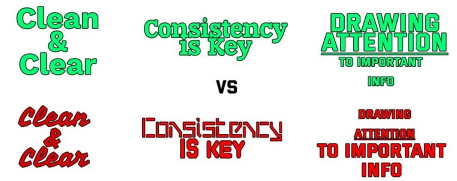
Your signage should be an extension of your brand identity. Harmonize colors, fonts, and design elements to create a cohesive and memorable brand image.
Before installing any signage, be aware of local regulations and permits required. Violating these rules can lead to fines and tarnish your business’s reputation.
Resist the temptation to include excessive information on your signage. Keep it simple, focusing on conveying a clear message rather than overwhelming potential customers.
Honesty is crucial in business. Avoid exaggerated claims or misleading content on your signage, which may lead to customer distrust and legal consequences.
Invest in high-quality materials for your signage. Faded or damaged signs can convey a negative image of your business, so periodic maintenance is essential.
While creativity is encouraged, avoid unconventional or confusing sign placements. Ensure your signage aligns with the traditional viewing patterns of your audience.
In the world of business, first impressions matter immensely. When a potential customer walks past your store or drives by your company vehicle, your signage is often their first interaction with your brand. Effective signage can draw people in, convey important information, and leave a lasting impression. It’s not just about placing your business name on a signboard; it’s about creating a design that psychologically resonates with your target audience. In this blog post, we’ll delve into the psychology of effective signage and how design choices can influence customers.
Signage makes your business visible. It helps potential customers find you and remember your brand. A well-designed sign reinforces brand awareness, making it more likely for customers to choose your business over competitors.
Signs convey essential information such as your business name, logo, hours of operation, and special offers. Effective signage communicates these details clearly and succinctly.
As mentioned earlier, your signage is often the first point of contact with customers. It sets the tone for their entire experience with your business. A professionally designed sign can create a positive first impression.
Color Psychology
Color is one of the most powerful elements in design. Different colors evoke various emotions and associations.
Your choice of colors should align with your brand identity and the message you want to convey. Maintaining consistency in your color scheme across all branding materials is essential.

Don’t hesitate to call or send us an email, we’re here to help.
(772) 562-9263
csr@bristersigns.com
The fonts you choose can significantly impact readability and perception.
Color is one of the most powerful elements in design. Different colors evoke various emotions and associations.
Your choice of colors should align with your brand identity and the message you want to convey. Maintaining consistency in your color scheme across all branding materials is essential.
Consider the location of your signage carefully. It should be visible to your target audience without obstruction. The height, angle, and distance from the viewer all affect the sign’s impact.

Now that we’ve explored the psychology of signage design, here are some practical tips to help you create effective, high-impact signs for your business: